General Layout
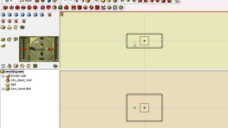
When you start Quark for the first time, it’s a real mess. There are too many icons, and especially there is four layout windows. We don’t need as many windows.
We are going to simplify this by changing the general layout. It’s easy, look at that picture and do the same.
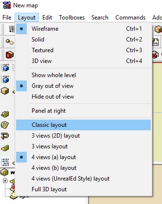
You will end up with two views. This is better because you gain space, it make things easier.
The Compass
Now you need to understand what is that strange compass at le the left. This compass allow you to modify the point of view of the general layout. This is very useful and you will soon be addicted to it. The compass is divided into 3 parts:
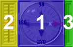
- 1 This allow you to rotate the scene from the Y view
- 2 This allow you to rotate the scene from the X view
- 3 This allow you to zoom in/out ( this can also be done by click and drag mouse3 )
Make a test with this configuration, it will help you to understand: (then go back to the default position)
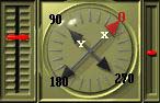
The right mouse button allow to translate (X or Y) the view by click and drag.
The Grid 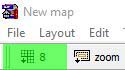
By default, Quark sets the grid to 16. But in True Combat, things are a bit finer. Click on the grid icon ( not the number ), and then you will be able to set the grid size.
The grid help you to move polyhedron / entities around the map and make them jointly/geometrically perfect. This is really important, but don’t worry, you will rapidly need to change the grid size while creating things.
Also notice that objects snap to grid while you move them. This mean a object can be in half between two unit. This grid has no effect in game, it’s only a tool for the mapper. But a realy important tool.
Toolbars

Quark comes with many advanced tools that could be scary. You should not. Every icon is provided with a little description. So rollover them to learn more.
But having to many tool is confusing. The better is to remove what we don’t need. To do that, you can setup your own config. My suggestion is to use the basics, like on the following picture.
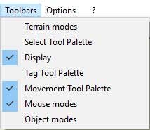
By simplifying the interface, we appropriate the software by a better understanding of the available tools.
The tools we left behind are really powerful. But at this point , we don’t need them.
Sidebar
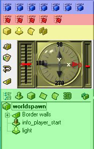
The sidebar is mainly divided into 4 parts (the fifth is the compass we have already seen).
The blue area allows you to add content to the map. Each blue cube represents a different type of content: either polygons or entities.
Some of the contents are for Quake 3, but the last cube is dedicated to True Combat.
The red area is dedicated to the texture.
The yellow area is a shortcut for adding a polygon, a light or a bezier curve into the map.
The green area is the tree view: it’s like the file explorer under windows. It allow you to browse the content of the map. Each icon at the top is dedicated to the properties of the selected object. When you select an object onto the map, this aera automaticaly toggle to the corresponding icon and show you the proporties/variables. This is also where you can group things into a folder for a better organization.
Now what?
I suggest you to play a bit with the interface to learn and test it. If you want to have more accurate information than mine, I invite you to look at the QuArK Information Base.
The next step will be to creat a door for True Combat.